
How I Designed Overbooked
- Daryl Chow

- Mar 20, 2019
- 5 min read
Updated: May 23, 2022
To commemorate the release of the Singaporean version of Overbooked hitting Millennia Walk this week, I thought I would talk a little bit about how this light-hearted family game was born. A game designer's ultimate goal is to bring a fun experience to as many players as possible, and I'm happy to say Overbooked has found audiences all over the world for its easy-to-learn accessibility as well as its gamer-satisfying challenge. Be it Germany, Singapore or Taiwan, the universality of the airline theme and intuitiveness of the puzzle mechanics have delighted players across all ages.

A number of people have asked me in the past how I came up with the idea for Overbooked. I may have given them varying answers because the process itself was jet-engine quick - it took about 4-5 hours to sit down and hammer out all of the game math, and since that turbocharged outburst, none of the game assets have changed much besides a couple of tweaks here and there. However, although the actual design process took shorter than some playtesting sessions, upon reflection there needed to be a number of things in place for this to happen.
The first circumstance was that Randomskill Games, the publisher of Overbooked, was currently on the lookout for games to publish. We were sitting and talking about what themes would attract attention before we chanced upon the topic of social injustice and David Dao, the protagonist of the United pre-flight ejection. It was a topic that was relatively hot-button at the time, and it seemed that it could be an intriguing theme for a game. At the time, there weren't many high profile games about air travel - and besides the recent Now Boarding, there still aren't that many, which is surprising considering how many games there are about trains.

I didn't really want to just design a game about planes, as I feel that there are already plenty of games about modes of travel (see train games above), and people more qualified than me to do so. I do however love management simulation games, and even as a gaming consumer, I can't get enough of those. So although I really wanted to tackle the social injustice aspect head-on, the approach angle of running your own airline and managing the flow of customers seemed much more intuitive to me as a game (plus it was something I had loads of experience designing).
Th second circumstance was that I was on a roll of incorporating spatial elements into my game designs. At that point, I had designed three straight games that involved card or tile placement in some way (a streak that I believe may still be alive) and all I needed to do to reignite the spark was to look at the seating chart of a plane.
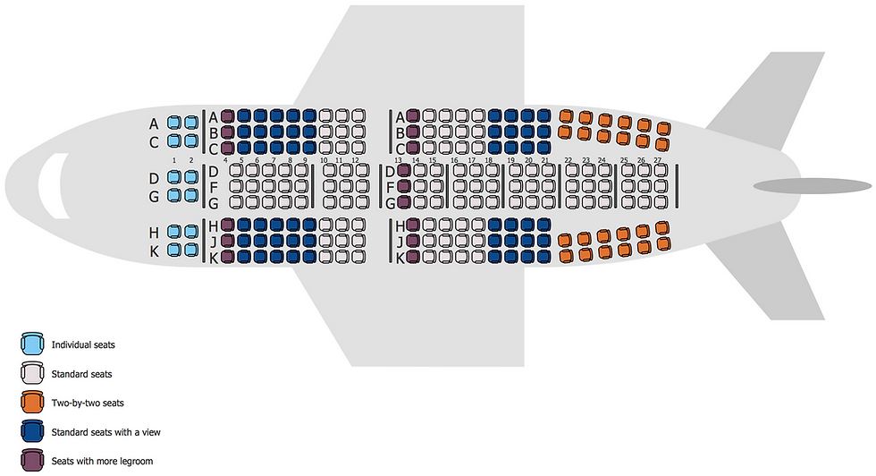
I always try to do as much research as I can when I'm locked into a theme, mostly because I love to learn about stuff but also because sometimes you chance upon the possibility of sparking your latent creativity with an image or an idea, and this was a pure lightning bolt to the brain. Here was a grid that people were already familiar with, and filling in the blank spaces with as many passengers as possible seemed like a natural way to start. I kept the 3-4-3 plane configuration for the main game (which was an exact 50 spaces, a great sign), and used a 4-4 configuration for the 4 player version due to limitations on components. (Aside: Technically, there is no plane that has a 4-4 configuration, but there are upper decks that are 2-3-2 or 2-4-2, so I'm claiming artistic license here.)
That wasn't enough of a game to me, so I considered having different types of passengers that you had to satisfy to get bonus points. I designed a whole bunch of passenger types but ended up only keeping the simplest and most intuitive ones - I did initially have different ways of scoring for all the 5 colours but trying to match colours together always seemed to be the most fun. That's the reason why even though there are 5 different colours, there are only 3 ways of scoring in the game. Another plus point was that this made the game much easier to learn, and one thing I've learnt from the Japanese is to never over-complicate a game unless you really need to.

One big challenge for me while designing the game math is that I only saw the nuts and bolts behind the numbers, and I thought there was no way the game could be fun because it felt overwhelmingly abstract to me. I didn't think people would enjoy taking coloured bits and placing them into different spots (which is why I'm grateful that the Jumbo version actually has passenger faces), and I actually didn't think that the game would work as it was while designing it. When I played the prototype (on an squared exercise book, as it seemed tedious to draw so many squares for a game I didn't think would work) for the first time with other players and saw that they didn't mind the fiddliness of picking and placing coloured tokens, I knew my biggest obstacle had been overcome. (Aside: In fact, the cleanliness and simplicity of the colours and information design may be a reason why folks could prefer the original version over the Jumbo version. I've seen different versions of games, but not such stark contrasts in different versions - and I hear there are more in the pipeline!)

As I was worried about the game being too abstract (again, this was at a time when there were only coloured circles and squares), there were two theme-inspired mechanics that I integrated into the game. First was the concept that cards with only 2 passengers could be placed in the window, aisle, and centre seats. This worked well because you want flexibility in placement of your passengers, but this comes at the cost of bringing less passengers into your plane. In hindsight, this also really shored up the mechanics, because the game had to have some cards that could bring players some much needed relief, especially towards the end of the game. A nice twist that these cards bring is that you want to avoid them at the beginning so you can bring in more customers, but then you really need them on your last few turns to cut down on overbooking.

The second theme-inspired concept of course is what the game was named after - the overbooking mechanic. Originally, I considered just having the players discard cards they couldn't fit and taking penalties for discarding them (a way that can actually still be played), but I made use of the fact that I had movable pieces on the board to be able to target individual passengers to make it even more of a puzzle (and also to allow players to indirectly manipulate the colour combinations on their plane). Thematically, this was also a good move because due to the power of your imagination, it feels like you're being mean to the passengers, even though they are literally just wooden circles on the board. And this is still the part that new players laugh and make jokes about, which to me is a big draw for a game.
At the moment of creation, Overbooked felt like a clever game, but didn't feel like a game that gave me a huge amount of satisfaction upon its completion (I may have already spent as much time writing this article!) There are many more games that I designed before and after Overbooked that I bled much more for - some that are much more satisfying to play, and some that are much easier to learn. Because of the short amount of time I took to design it, it never felt as meaningful than some games I took months and years to tweak. Now, however, as I look back upon the process, I came upon a realization - It may have been those 5 hours that brought Overbooked to life, but it was the decade of game design experience preceding those 5 hours that gave Overbooked its soul.


Comments